Think in 4D: The Time Dimension 99% of Devs Ignore in Screen Design
I have a confession: for years, I designed screens like photographs. One screen = one frozen state. Layout, colors, typography. I’d check the Figma, it looked good, I moved on.
But an app isn’t a photograph. It’s cinema.
A user rarely spends more than 3 seconds on a “final” screen. The rest of the time, loading, transitioning, progressive appearance, is dead time that most devs treat as a bug to hide. Center spinner, fingers crossed.
But that dead time? It’s your biggest UX opportunity.
Screens have 4 dimensions, not 2
When we think “screen design,” we think X and Y. Width and height. But a screen in a mobile app lives in time. It has states:
- Empty, the user arrives, nothing is loaded
- Loading, data is incoming, but the screen is already visible
- Transitioning, moving between states (opening, closing, navigating)
- Interactive, the screen is ready, the user acts
- Feedback, the user acted, the screen responds
Most apps handle state 4 and ignore the rest. The best apps, Stripe, Airbnb, Duolingo, build every state as a mini-screen in its own right.
Luke Wroblewski said it well: “Show, don’t tell. Every pixel of loading time is a pixel of your brand.” The best interaction designers don’t ask “how do I hide the loading”, they ask “how do I make the loading pleasant.”
The spark for BeeDone v3
When I started BeeDone v3 with a UX designer using the BMAD method, the first thing he asked wasn’t “show me your mockups.” It was:
“Show me the journey from splash screen to home. Show me every frame.”
And I realized: I’d never thought about that journey. I had a splash, then a loader, then the home. Three independent steps. Zero continuity.
We rethought everything as one continuous sequence. The splash logo animates into the home logo. Elements don’t appear all at once, they “enter” in a cascade. The bottom sheet doesn’t mechanically slide up, it responds to context.
The result? The app feels alive. Not because animations are everywhere. Because every transition tells a story.
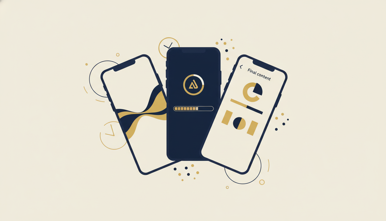
The 6 weapons of intelligent loading
Here’s what we implemented in BeeDone v3, each technique solves a specific “time” problem:
1. targeted shimmer (Placeholder atom)
Classic shimmer: the entire screen pulses gray. Useful in 2018.
Targeted shimmer: each area of the screen has its own shimmer shape. The task list shows horizontal rectangles. The avatar shows a circle. The header shows a thicker bar.
In BeeDone, ShimmerPlaceholder uses a 0.3→0.6 alpha pulse over 1200ms. No external library needed, 30 lines of CustomPainter. The user doesn’t see “a loader.” They see the shape of what’s coming.
2. animated logo in transition
The logo_animated.gif is our visual thread. It appears in 4 places:
- Splash screen
- Onboarding screen (goal input)
- Update dialog
- Weekly tab
Every time, it’s the same logo, same animation. This creates a temporal identity, the user knows “I’m in BeeDone” even during loading.
3. fake progress bar (not so fake)
This one is diabolical. The FakeLoadingProgressBar in routines displays a blue→yellow progress bar that advances… but never reaches 100%.
Why? Because a real progress bar that stalls is worse than no bar at all. The user stares at it and panics. Our fake bar gives a sense of movement without promising a precise endpoint. It’s perceived velocity, you feel progress without stressing about the exact time.
Same psychology as installer screens saying “Almost there!” Movement soothes. Stillness creates anxiety.
4. hero animation, splash → home → bottom sheet
This is the centerpiece. MainLogoHero uses Flutter’s Hero system to create visual continuity from splash to home:
Splash (centered logo) → Home (header logo) → Bottom Sheet (miniature logo)The logo moves and shrinks following the user’s path. No visual break. No “white flash” between screens. It’s like a long take in cinema, the camera follows the movement without a cut.
Google says it in their Material Design guidelines: “Motion provides meaning. Objects can transform and reorganize, not just appear and disappear.” The Hero widget is the materialization of this principle.
5. circular progress indicator, the subtle signal
The LoadingCircle in brand yellow (kColorYellow, 40px) appears in dialogs and secondary transitions. No “Loading…” text. Just a spinning circle in the brand color.
It’s a deliberate choice: circular progress says “working,” shimmer says “arriving,” hero says “you’re in the right place.” Each loading pattern communicates a different message.
6. entrance fader, choreographed appearance
EntranceFader is used on backlogs, breathwork text, motivational quotes, and the main router. Each element appears with a calibrated delay:
- First element: instant
- Second: +200ms
- Third: +400ms
This isn’t art for art’s sake. It’s temporal hierarchy. The user’s eye naturally follows the sequence. They read the title first, subtitle next, content last. The animation guides attention, like a conductor bringing instruments in one by one.
The time × state matrix
Here’s how we mapped each technique to a specific moment in the user journey:
| Moment | Problem | BeeDone Solution | Technique |
|---|---|---|---|
| Splash → Home | Visual break | Traveling logo | Hero Animation |
| Empty home | White screen anxiety | Shapes of incoming content | Targeted Shimmer |
| Routine running | Perceived long wait | Bar that advances (never 100%) | Fake Progress Bar |
| AI generating task | Nothing happening | Letter-by-letter typing | Typewriter Effect |
| Bottom sheet opens | Abrupt appearance | Slide + fade choreography | Entrance Fader |
| Loading dialog | Generic spinner | Branded yellow circle | Circular Progress |
| Onboarding | Information flood | Sequential delayed elements | Entrance Fader |
The pattern is clear: every “dead moment” is a design opportunity.
What the references say
I’m not the only one thinking this way:
Sam Soffes (ex-Stripe): “If you can’t make it fast, make it feel fast.” Perceived performance matters more than actual performance beyond 200ms.
Luke Wroblewski (Google) in his talk Designing the Time Dimension: transition states are the “moments of truth” of an app, that’s where the user decides if your app is polished or cheap.
Flutter Hero: the Hero widget exists specifically for this problem. It creates a shared element animation between two routes. The docs say “A hero animation is a shared element transition that flies from one page to another”. It’s not a gimmick, it’s a navigation paradigm.
Stripe: their checkout is a masterclass. The shimmer takes the exact shape of the card field. The progress bar shows steps. Every microsecond is designed.
Airbnb: their skeleton loading in search is probably the most copied in the industry. Each placeholder matches the shape of the final content.
The trap: too much animation = motion sickness
I almost fell into it. Once you understand the power of transitions, you want to animate EVERYTHING. Every button, every text, every icon.
The rule I set for myself in BeeDone:
- Animate context, not content, transitions between screens, not buttons
- One hero per journey, the logo travels from splash to home, that’s enough
- Delays < 500ms, beyond that, it’s waiting, not anticipating
- Never bounce/elastic, it’s 2026, not 2014.
easeInOutcurves suffice
The goal isn’t for the user to notice the animations. It’s for them to feel them without seeing them. Like film music, if you notice it, it failed.
What it changes concretely
BeeDone v3 isn’t “prettier” than v2. It’s smoother. And smoothness is what separates an app that “works” from one people love using.
The concept is simple: stop thinking of your screens as pages in a book. Think of them as scenes in a film. What happens between scenes is as important as the scenes themselves.
The time dimension isn’t a bug to patch. It’s a canvas to design.
If this resonates and you want to see the result in action, BeeDone v3 is coming soon. In the meantime, I share the dev process on youcefelkamel.com.
What about you, do you think about the time dimension in your apps? Or do you drop a CircularProgressIndicator in the center and move on? 😄